
Resampling filters
Imagine a photo up close. It is a grid of tiny colored squares, called pixels. When you make that photo bigger or smaller, those squares no longer sit on the squares of the new size. The computer has to paint new ones. If it does that carelessly, the picture turns blurry, or blocky and jagged.
A resampling filter is the recipe for those new squares. It looks at the pixels around a spot and blends them, the way a careful brush would. RIOT offers seven recipes. Lanczos3 is already selected, and it is the one to leave on for photographs. The others are there for pixel art, for a softer picture, or for a crisper shrink.
What a filter does
Making a picture smaller means several old squares have to become one new square. A sky is easy, because those squares are almost the same color, and the blend still looks like sky. A railing, a checked shirt, or a diagonal line is harder. Along that line the squares jump from black to white.
If the filter grabs only one of them, you get stairs, or a stripe pattern that was not in the photo. If it blends them, thin lines turn gray and the edge looks a little softer. The pictures further down show both.
Making a picture bigger means inventing squares that were never there. A smooth filter blends the neighbours, so a hard edge gains a few steps of gray. Nearest copies the nearest square and keeps the blocks, which is what pixel art wants.
No single filter can be sharp, smooth, and free of odd edges all at once. Each one below is a different brush.
Which filter to pick
Find the filter in Resize → Resampling filter. Names stay in English in every language.
| Filter | Reach for it when | Watch for |
|---|---|---|
| Nearest | Pixel art, icons, and interface graphics scaled by a whole number such as 2× or 3×. | Stairs on diagonals, and false patterns when a photograph shrinks. |
| Bilinear | A quick, soft result when a halo would be worse than a little blur. | Fine detail goes gray, and a strong shrink can still show moiré. |
| Cubic (Catmull-Rom) | Text, logos, screenshots, and any enlargement. | A small halo on hard edges. |
| Mitchell | Photographs and graphics where a halo is the thing you most want to avoid. | Detailed photos look a little soft. |
| Lanczos3 | Shrinking photographs. This is the default. | A visible halo on text, logos, and other hard edges. |
| Magic Kernel Sharp 2013 | A photograph, when you want a little more punch than Lanczos3. | The strongest bright fringe of the seven. |
| Magic Kernel Sharp 2021 | A photograph, when you want the Lanczos3 result without the extra punch of 2013. | On a hard drawing the bright line is still there, close to Lanczos3. |
Shrinking a photo: leave Lanczos3. If text or a logo grows a bright outline, try Mitchell or Cubic. Pixel art and hard-edged icons: Nearest, at a whole-number scale.
Enlarging is a shorter list than the menu. Nearest and Bilinear enlarge with their own methods. Cubic, Mitchell, Lanczos3, and both Magic Kernels enlarge with the same Cubic curve. The five diverge when you shrink. The reason is in why enlarging shares one curve.
Where each filter looks best
Each row is one picture, run through all seven filters. When one result is clearly the one to keep, a red frame marks it. On the photographs, Lanczos3 and the two Magic Kernels are close, so those rows have no red frame. Some results are magnified, so a stair or a bright line is large enough to spot. You can scroll a row sideways.
Nearest: pixel art, made smaller
Nearest is the simplest brush. It copies the closest old square and paints it as a block. Enlarge pixel art by 2× or 3× and those blocks stay crisp, in the original colors. On a photo, a diagonal turns into stairs, and a shrink can turn a thin line into a fatter stripe that was never there.
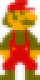
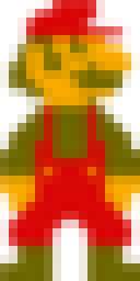
This sprite is drawn as big solid squares. It was reduced until those squares are one pixel each, then magnified so you can see them. You want the hat, the eye, and the overalls to stay blocks of flat color.
Nearest copies each square and keeps its color. The drawing still looks drawn.
The other six mix neighbouring squares. The edges go soft, and the sprite turns fuzzy. When you shrink pixel art and you still want the pixels, Nearest is the one that keeps them.





Bilinear: a curve with no bright line
Bilinear only blends the squares right next door, in a straight fade from one to the next. It is fast and soft. Fine lines turn gray. You almost never get the bright outline that sharper filters leave around text.
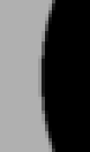
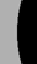
The edge of a black circle on gray, reduced to half size, then magnified. Picture a round button or a logo.
Nearest turns the curve into stairs. Lanczos3 paints a pale line just outside the black. Magic Kernel Sharp 2013 paints a brighter one. Mitchell is close to Bilinear, with only a hint of that line.
Bilinear fades from black to gray and leaves the gray alone. On a button, a logo, or a face, the pale line reads as a glow. Bilinear is the filter that leaves the curve soft and clean.




Cubic: a smooth shape, made larger
Cubic is a smoother curve. It stays sharper than Bilinear, and the bright outline on a hard edge stays short. It is a comfortable choice for text, logos, and screenshots. When you enlarge with Mitchell, Lanczos3, or either Magic Kernel, RIOT uses this same curve.
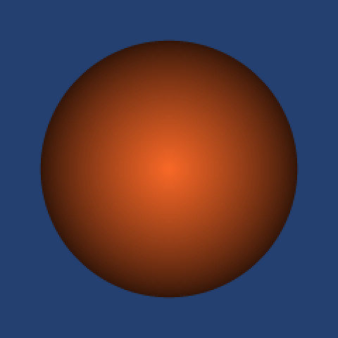
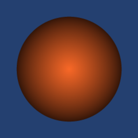
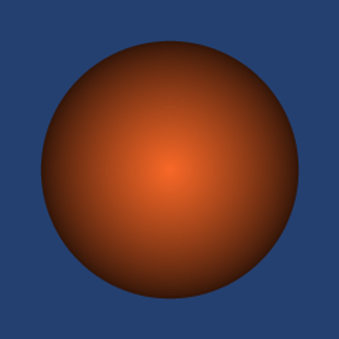
The same shaded ball, enlarged to twice the size. You want a round edge and an even shade.
Nearest keeps the little squares, so the outline breaks into stairs. Bilinear stays round and softens the shade. Cubic stays round and keeps the shade clearer. The corner of each ball is that edge, magnified.
Mitchell, Lanczos3, Magic Kernel Sharp 2013, and Magic Kernel Sharp 2021 use Cubic when you enlarge, so they match the Cubic ball.



Mitchell: a small light, made smaller
Mitchell is the gentle version of that same curve. It was built as the middle ground: clearer than a plain blur, with almost no glow around the edge. Photos can look a little soft next to Lanczos3. Pick it when a bright line along a thin edge would bother you more than a bit of softness.
A small bright circle on a dark ground, reduced to half size, then magnified. Picture a distant light, or the reflection in an eye.
Cubic is sharper than Mitchell. On a big letter that extra sharpness looks better, because the line it adds is only a pixel wide and easy to miss. Here the circle is small, so that sharpness shows up as a dark ring around the light. Lanczos3 paints a darker ring. Magic Kernel Sharp 2013 paints the darkest.
Nearest turns the circle into a blocky shape. Bilinear stays round and soft, with no ring. Mitchell is softer than Cubic. The circle stays round and bright, and the dark ground around it stays even.







Lanczos3: a real photograph, made smaller
Lanczos3 is the default, and the one to leave on for photographs. Picture each pixel as a pebble dropped in a pond: a splash in the middle, then ripples. A perfect resize would follow every ripple from every pixel, which is far too much work. Lanczos3 keeps the splash and the first three ripples, then lets the rest fade out. That wider look is why a photo stays crisp when it shrinks. The leftover ripple is also why a hard edge can grow a faint bright outline.
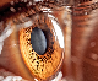
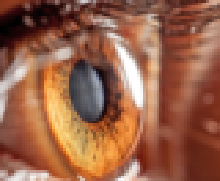
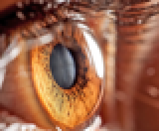
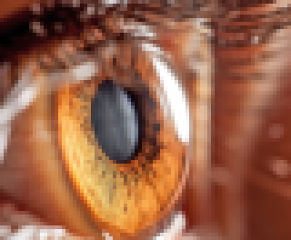
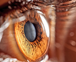
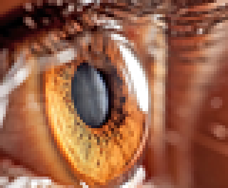
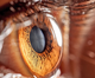
A close-up of an eye. The picture below is the photograph. The seven after it are that same photograph, reduced to about an eighth of this size, then magnified so each new pixel is large enough to see. You want the lashes, the fibers in the iris, and the bright reflection to stay separate.
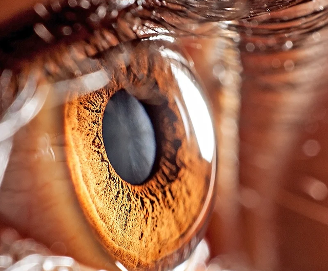
Nearest breaks the lashes into blocks. Bilinear washes them into the skin. Mitchell keeps them, a little softer.
Lanczos3, Magic Kernel Sharp 2013, and Magic Kernel Sharp 2021 are close on this photograph. 2013 pushes the contrast a little harder, so fine detail goes darker and the pupil can pick up a harder edge. 2021 sits nearer Lanczos3. Which of those three you prefer is taste. Lanczos3 stays the default.
Magic Kernel Sharp 2013: a little more punch on a photograph
Magic Kernel Sharp 2013 starts from a soft blend, then adds a short sharpen. This is the idea Facebook and Instagram used for photos. The picture looks punchy, and thin lines stay dark. The bright outline on a hard edge is the strongest of the seven.
On a hard drawing the bright line is easy to see, and Cubic or Lanczos3 can look cleaner there. A photograph is a better place for these two. This color picture is reduced to half size, then magnified. Look at the small letters on the badge.
Nearest breaks the edges into steps. Bilinear lets the small letters go soft. Mitchell is close to that. Cubic keeps the letters clearer.
Lanczos3 keeps the letters. Magic Kernel Sharp 2013 keeps them and pushes them a little darker. That extra darkness is the punch. It is the same step that paints the bright line on a hard drawing.
Magic Kernel Sharp 2021: the same photograph as Lanczos3
Magic Kernel Sharp 2021 is the later version of that same idea. The sharpen step is tuned so a flat area stays the color it already was. On a photograph it stays with Lanczos3. On a hard drawing both still paint a bright line, and 2013 paints a brighter one.
Magic Kernel Sharp 2021 keeps the letters with Lanczos3. On this photograph the two match. The bright line that stands out on a hard drawing does not open a gap between them here. 2013 is the one that still pushes darker. Pick 2021 when you want the Lanczos3 result on a photo, without that extra push.
The same drawing, seven filters
One black rectangle, one disc, and the letters “Ri”, on a gray field, reduced to half the width and height. Gray is there so a bright fringe can show; on pure white that fringe is clipped away. At this size the filter does the whole resize.







On a large shape the seven are close. Nearest is the one that breaks the disc and the letters into steps. The rest of the difference sits in a pixel or two at the edge, which is the next picture.
The edge, up close
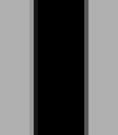
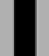
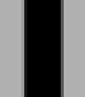
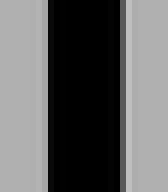
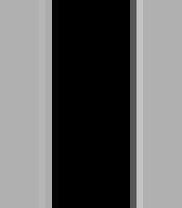
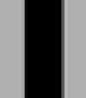
A black bar on the same gray, also at half size, then magnified 6× with Nearest so each block is one pixel of the resized bar. Read the fringe beside the black.

What the artifacts look like
The usual complaints about a resize have names. These charts are built so each one is easy to see. A photograph is gentler than a black bar.
Stairs and false stripes
Shrinking turns several old pixels into one new one. A flat wall is fine with that. A diagonal edge, a railing, window blinds, or a checked shirt is harder, because those lines can be thinner than the new pixels.
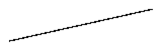
The filter then does one of two things. Nearest keeps a single old pixel and drops the rest, so the picture stays harsh black and white. A wide filter such as Lanczos3 mixes the old pixels together, so lines that no longer fit turn gray.
A straight line becomes stairs
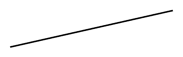
This line was straight. It was shrunk to a quarter of its size. The shrunk versions are magnified so each new pixel is big enough to see.

Thin bars turn into the wrong pattern
The fence below starts with wide bars on the left. Toward the right the bars get closer, the way a railing looks as it runs away from you.
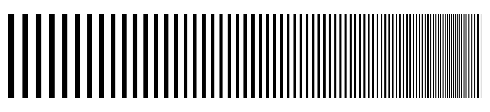
The wide bars still look like bars after every filter. The right-hand end is the problem. There, the gaps are thinner than the pixels of an image shrunk to a quarter. This is that end, before and after.
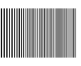
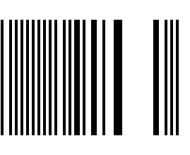
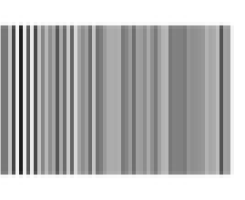
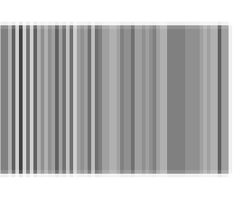
Both outcomes lose the fine bars. They were too thin to keep. Nearest replaces them with a sharper-looking pattern that was not in the photo. Lanczos3 and Bilinear replace them with gray. Mitchell, Cubic, and both Magic Kernels do the same kind of thing as Lanczos3 on this fence. They differ in how dark the wider bars stay, and in the bright fringe on a hard edge, which is the next section.
On a shirt, a brick wall, or a screen door, Nearest’s made-up pattern often shows up as waves. That wavy kind is called moiré.
Halos, or ringing
Here is the ripple you can actually see.
Take a dark shape on a lighter background: black text, a logo, a window frame. A sharp filter such as Lanczos3 does not stop at the edge. A little of the ripple keeps going. On the light side, that shows up as a thin bright line, lighter than the background around it. Just outside the bright line, you sometimes get a thin darker one. Together they look like a faint glow, or like someone traced the shape with a highlighter.
That glow is the halo. Because it comes from the ripple, people also call it ringing.
The bar below is black on gray. It was made smaller, then magnified so the line is wide enough to see. Watch the gray that touches the black.
You will notice this on text and logos. On a pure white page the bright line often disappears, because white cannot get any lighter. Look for it on gray, on skin, and on sky.
The pond, a little further
The ideal version of this idea is called a sinc filter. In the pond picture, its ripples go on forever. To get a perfectly sharp resize, the computer would have to follow every ripple from every pixel. That is far too much work.
Lanczos solves it with a window, a cutoff. Keep the splash and only the first few ripples, then fade everything else out to nothing. The number is how many ripples you keep. Lanczos3 keeps three on each side of the splash. That is the usual setting, and it is the one RIOT selects for you. Some programs also offer Lanczos2, which stops after two ripples and looks a little softer. RIOT does not list it.
Bilinear never makes those ripples. It only mixes the closest neighbours, so the edge just gets a soft gray step. Nearest does not mix at all. It copies one square, so the join is a single step.
Enlarging
Pixel art wants Nearest. Everything else in the menu, when you enlarge, is either Bilinear or Cubic. This sprite is enlarged 8×.



Mitchell, Lanczos3, Magic Kernel Sharp 2013, and Magic Kernel Sharp 2021 produce this same Cubic enlargement. Pick those four for how they shrink.
Going further
Open a section for the mechanism behind the pictures.
Why enlarging shares one curve
In RIOT, shrinking and enlarging are not the same job.
When you shrink, you really do get the filter you picked: Nearest, Bilinear, Cubic, Mitchell, Lanczos3, Magic Kernel Sharp 2013, or Magic Kernel Sharp 2021. A stronger shrink looks at more of the original pixels.
When you enlarge, the menu is shorter than it looks. Nearest still copies the nearest square. Bilinear still blends the neighbours. Mitchell, Lanczos3, and both Magic Kernels enlarge with Cubic, the Catmull–Rom curve. The sample sits on the middle of each pixel, so the grid stays centered.
How a strong shrink is done
A very small output would need a huge neighbourhood. RIOT splits a strong reduction: it averages whole blocks first, then runs the filter you chose on what remains. The filter handles about the last 2×, and the average does the rest. A reduction to half size skips that shortcut and uses the filter alone. The railing and the diagonal are quarter size, so they get the average first and then the filter.
The half-size drawing and the bar are the filter alone. That is why those are the pictures to use when you compare fringe and softness.
Cubic, Catmull–Rom, and Mitchell
Cubic and Mitchell are the same family. Don Mitchell and Arun Netravali described it with two numbers, B and C, in Reconstruction Filters in Computer Graphics (SIGGRAPH, 1988).
- Cubic in RIOT is Catmull–Rom: B = 0, C = 1/2. Sharper, a little ring.
- Mitchell is their recommended pair, B = C = 1/3. Softer, less ring.
- The cubic B-spline, B = 1 and C = 0, is softer again. RIOT does not offer it.
Both look at two pixel-widths of neighbourhood on either side of the sample. Lanczos3 looks at three. Magic Kernel Sharp 2013 falls to zero past 2.5, and the 2021 kernel past 4.5, which is why that one costs more.
Lanczos3
In the math, each ripple is called a lobe. Lanczos3 keeps three lobes on each side of the splash. The outer lobes dip below zero, which is the push that makes an edge look crisp and also paints the halo. The formula is a sinc curve multiplied by a second sinc that fades it out after those three lobes.
Some programs also offer Lanczos2, which stops after two lobes and looks a little softer. RIOT’s menu does not include it. Lanczos3 is the default.
Magic Kernel Sharp, 2013 and 2021
The Magic Kernel is John Costella’s resampler. In frequency it is a sinc cubed, built by convolving a box with itself twice. Alone it is slightly soft. The “Sharp” step is a short extra filter that puts the bite back.
Costella’s notes and the paper Solving the mystery of Magic Kernel Sharp define two versions. Sharp 2013 is the three-tap correction {−1, +6, −1} / 4. That is the family Facebook Photos used, and Instagram used a slightly stronger variant. Costella’s advice for most practical resizing is this 2013 kernel: it is the efficient one, and the mild sharpening is usually welcome. Sharp 2021 convolves that correction with another short filter, giving a seven-tap kernel that is spectrally flat to about nine bits, which leaves a flat signal at the same level. He suggests 2021 when that neutrality is the point. It rings more in the Gibbs sense, and it looks at a wider neighbourhood.
On RIOT’s bar, 2013 is the single strong bright fringe. 2021 is nearer Lanczos3, with a smaller bright fringe and a faint dark companion. That matches the menu: 2013 for a punchy shrink, 2021 as an alternative to Lanczos3.
Sources
The pictures on this page were made with the same filters RIOT uses.
- Don P. Mitchell and Arun N. Netravali, “Reconstruction Filters in Computer Graphics”, Computer Graphics (SIGGRAPH) 22, no. 4 (1988). The B and C parameters behind Cubic and Mitchell.
- John Costella, The Magic Kernel, and Solving the mystery of Magic Kernel Sharp. Definitions of Magic Kernel Sharp 2013 and 2021, and his notes on which to prefer.
- Anthony Thyssen, Resampling Filters, ImageMagick v6 Examples. A long illustrated tour of support, lobes, and windowed filters. The examples above use the kernels RIOT calls.